When the covid-19 pandemic took over the world, we were asked to stay in our homes as much as possible. After living in Tokyo for several years, staying in my house all the time made me feel I could be living in any other city, it wouldn't have mattered that much.
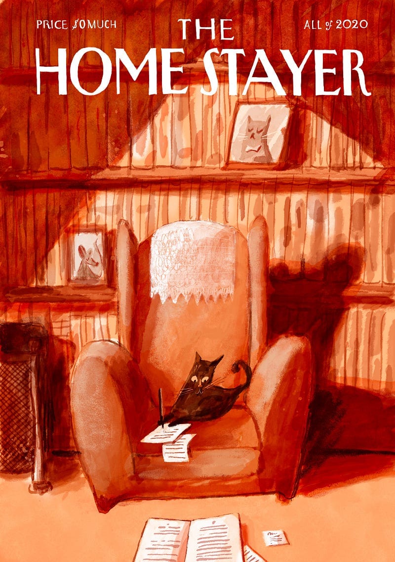
The Home Stayer


The Power of Personal Work
My job is to draw for brands and publications as an illustrator, and having more time to draw is always a good thing. When we were all stuck at home, it was a perfect chance to do more personal work, experiment and try new things. Some people started baking or making ceramics. I just drew, as I often do.
Literally, one of those gray days I just got my iPad and sat down, made the issue 1 (The Writer) and liked it. Then a couple of days later I made issue 2 and by issue 3 I realized they would do great cover series for the New Yorker, but I didn't want to be disappointed: if I were to send them to their Art Director, I am pretty sure they wouldn't have even reply. So I made a personal project out of them.
I set them out to be a series of faux magazine covers exploring this city we call Home. Scenes of the everyday, that you can’t place geographically in a clear place, but belong everywhere. I made the whole logo and look&feel to clearly relate to The New Yorker covers — please read below “The Background” for more on that — so the concept would be more clear.
My Most Successful Project to Date
I am very happy with what came out of just 9 (!) drawings. They unchained many events in my life I would never have dreamed of. Here's a list of things that would probably never have happened if there wasn't any Home Stayer:
• Working with my agent Handsome Frank.
• My successful Seoul show MUNDO MENDO.
• A lot of coverage on media, many instagram followers etc.
• Pushed me to starting my print shop, as the demand for prints was big.
• I ended up selling many prints, what gave me reasons for optimism in dark days.
But when I think about it, how come these mere nine drawings could make such a difference? What made them so special? Are they that good?
I think some of them are ok and a couple are plain bad, but it doesn't matter so much. They point is that they share a few details that can make us understand why they were successful:
• They are all linked to a personal situation the viewers were going through at the time.
• Most of the drawings appealed to an aspirational ambition for the viewer as in «I would love to live in that house».
• They had a visual linkage to something people already know and revere (The NYer covers).
And the most important for me:
• They were made in total freedom, without commercial goals in mind, without amends from others and without an agenda.
I had a limited edition of 50 for each, but most of them are gone. I am truly sorry.
If you are a lucky person with one of the 50, I'd hold on to it!
THE COVERS
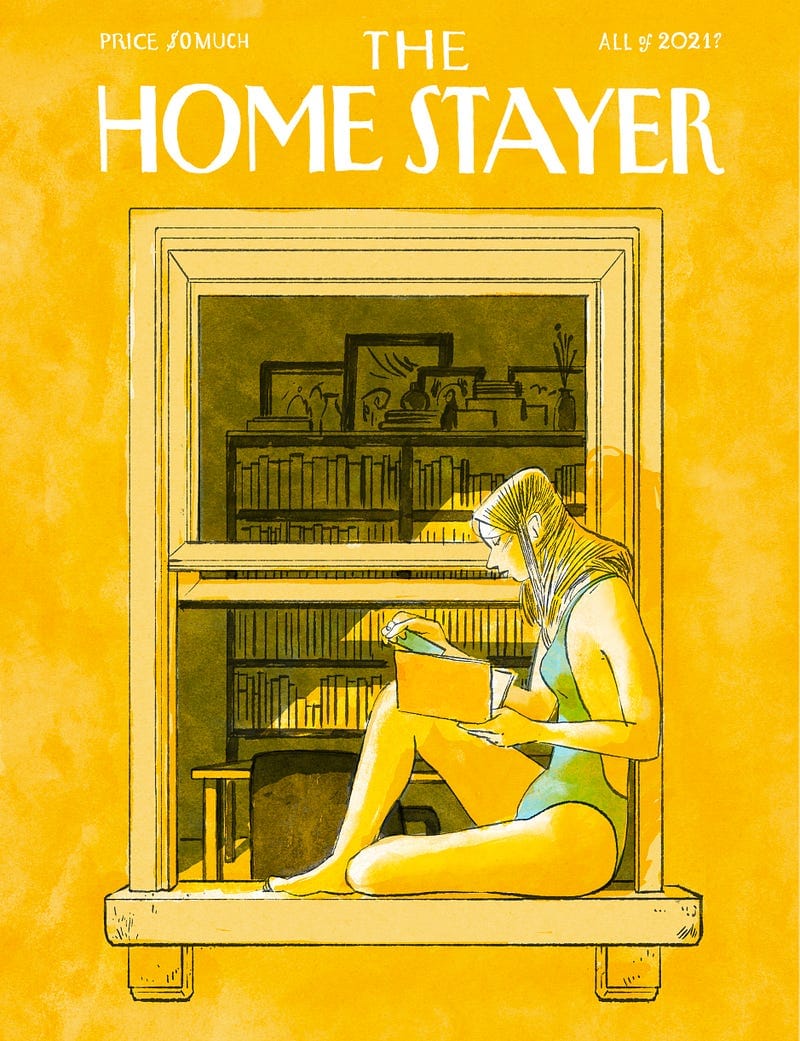
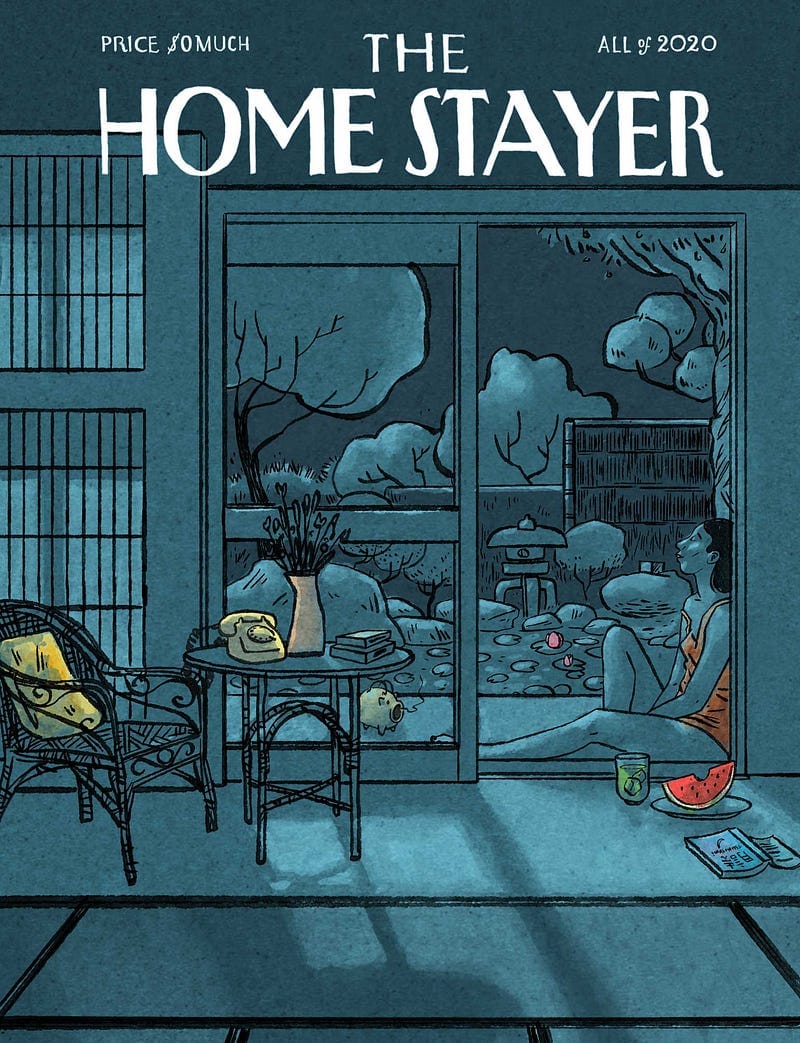
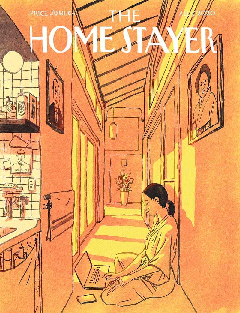
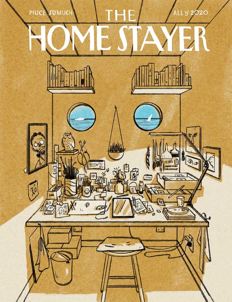
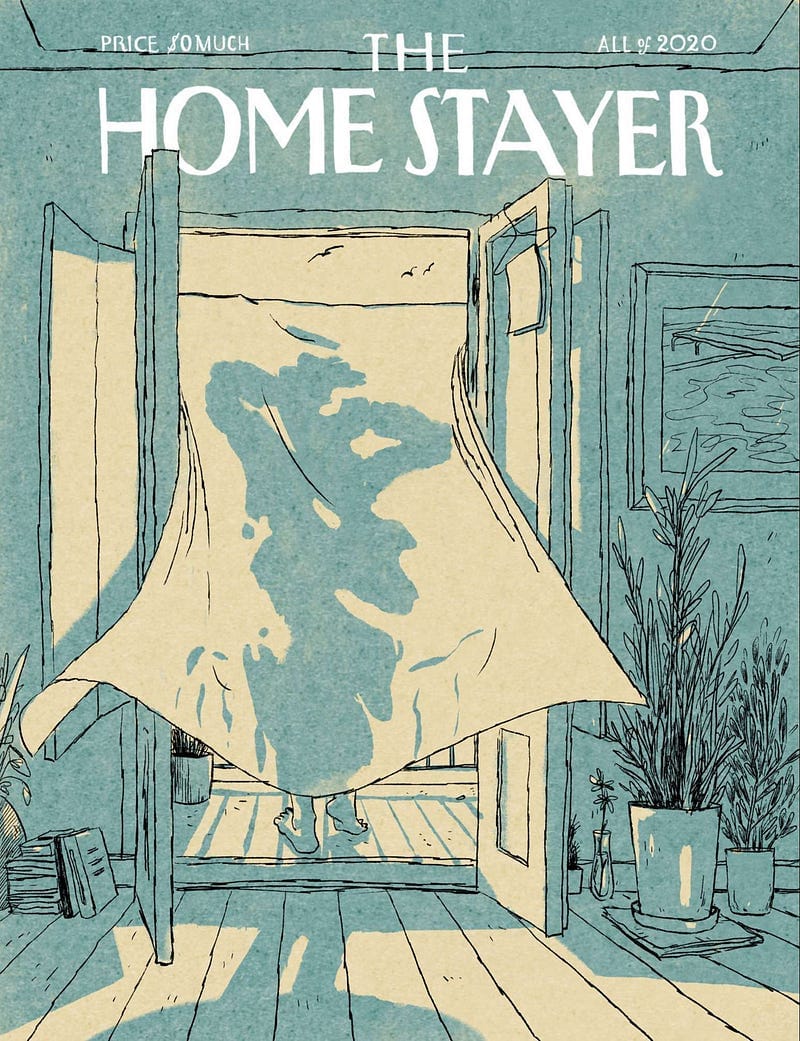
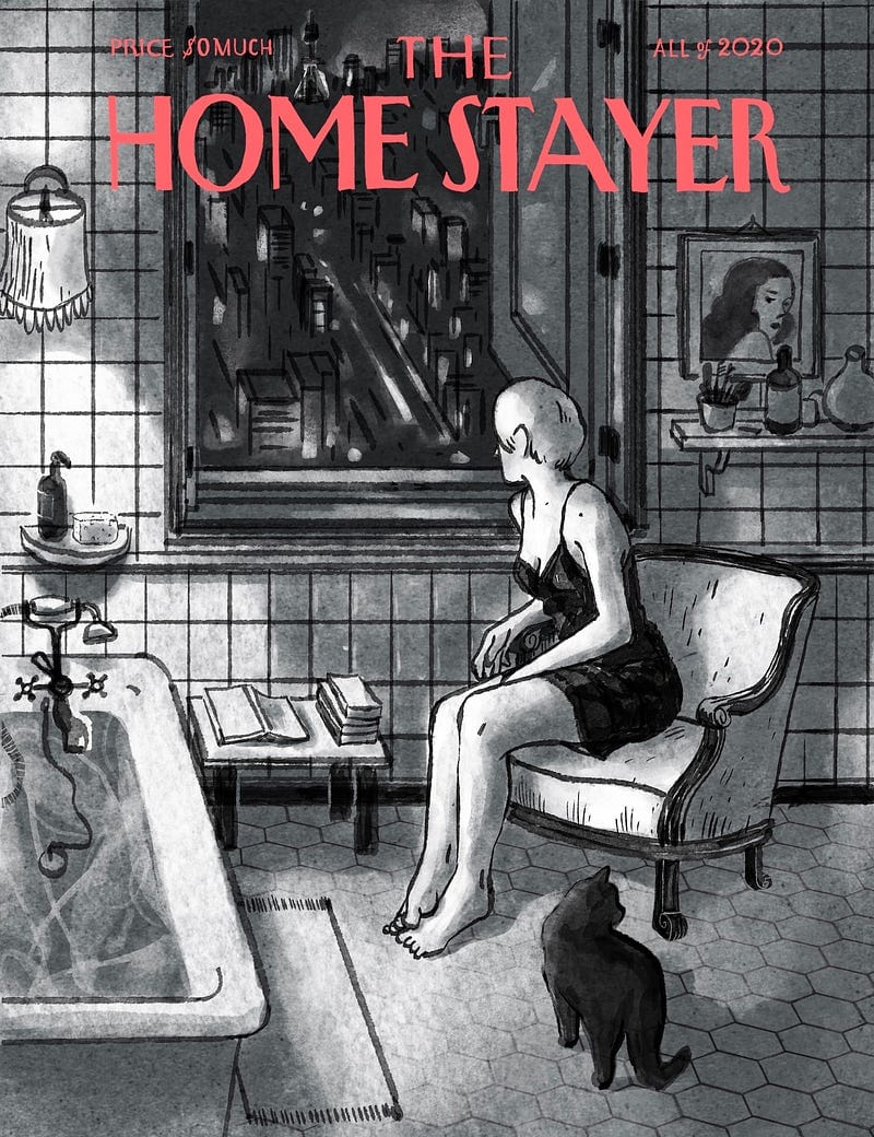
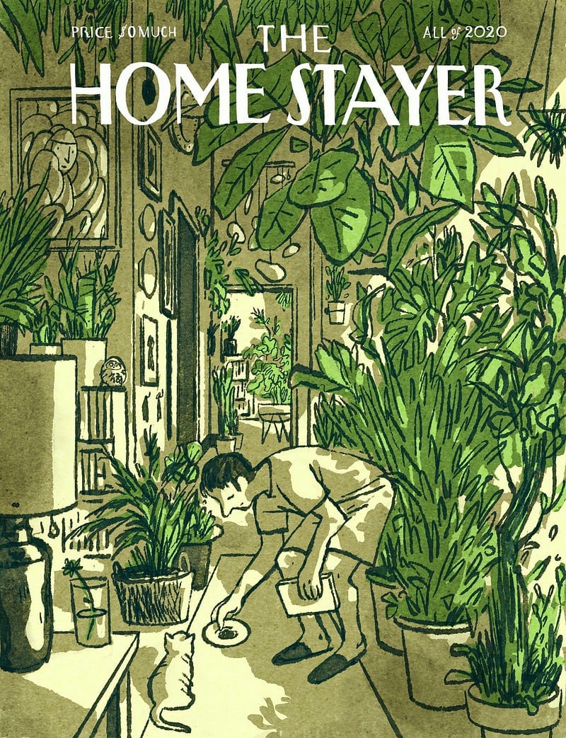
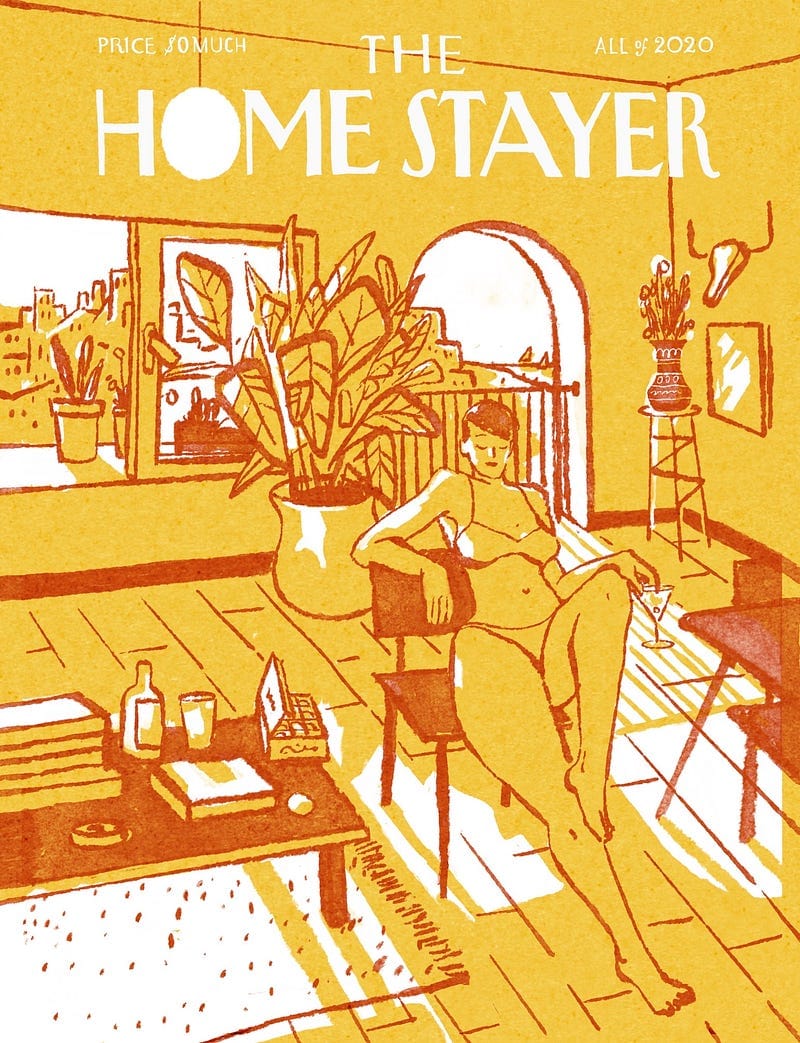
The Background
Everyone knows The New Yorker magazine by their iconic covers. They are famous for being made by great artists and give their view on urban NYC life and/or current affairs that affect the city.
Less known are initiatives like The Parisianer, The Tokyoiter and Le Montréaler. There are more (Shanghai, Barcelona, Kyiv…) All imaginary magazines, they are just series of covers. Podiums for artists to show the love for their city and expose their talent. They serve new and established artists.
Illustrating a cover for the New Yorker is a commission most artist dream of. The other cities’ variants are a nice second alternative.
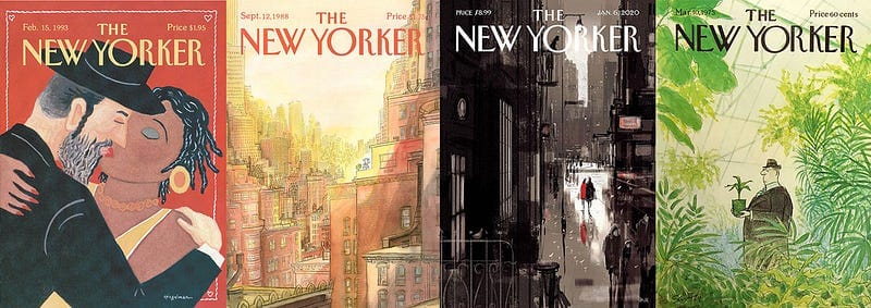


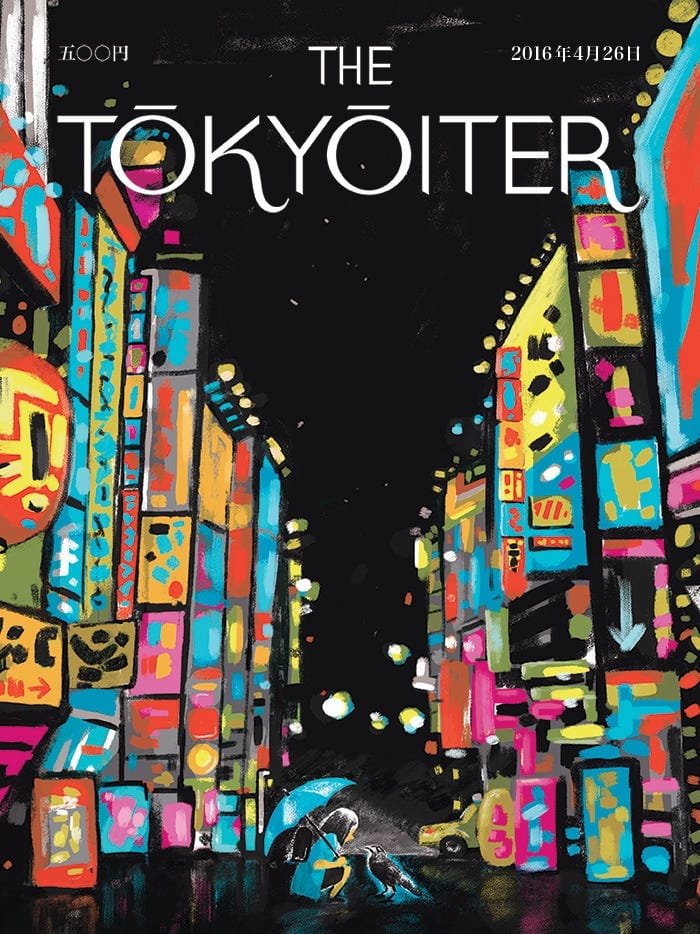
My Home Stayer project is a huge thank you to The New Yorker for supporting and elevating illustration, giving it an authoritative voice through the decades. Their memorable attitude towards art is an inspiration for many publications and a steady reminder to the editorial world that following trends is a dangerous path. Each publication should have a singular, recognizable voice and a remarkably vision in order to survive.
Of course all © belong to the authors and my covers are © by me.
Please ask me for permission if you want to use any of these artworks. They have already been stolen several times so if you stole them, you'd be unoriginal on that too.
With love from my living room,
⊙⟀⊙ Luis Mendo
